Sep 08, 2022 | Flooring Canada

A Townhome Renovation
Design by MARGARITA BRAVO | Photography by ZACH CORNWELL

Q: Tell us a little bit about your client’s needs for this townhome renovation.
A: Our client was a first-time homeowner for this place, and as such, she wanted to bring her personality into it. To do this, we needed to get to know our client—her likes, her passions, and so on. It turns out that our client loves the outdoors, nature, and traveling. Our design incorporated these aspects of her life.
Q: This is a small space. What are your initial thoughts when approaching a design that has a smaller square footage?
A: We are laser focused on functionality. We need to understand what is a priority for the client and what is not. Prior to designing the space, we try to gain a good understanding of the place’s workflow. Once that is done, we then add the aesthetic elements to the design. To achieve this level of knowledge, we ask a lot of questions about how the client functions in her space.

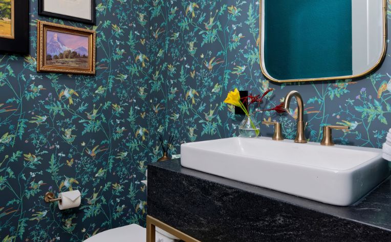
Q: Wallpaper is really hot right now, and we love the way you’ve used it in the powder room. Oftentimes, decorating with wallpaper can be tricky. How do you approach designing with wallpaper, especially in a small room such as the bathroom?
A: We believe the powder bathroom is a perfect space to design with wallpapers because oftentimes the powder bath on its own can be a great place to make a bold design statement. In general, wallpapers offer an incredible option to complement design features. They can also be the focal point of a room. Wallpapers are a great tool in your designer’s toolbox.
Q: Color is used liberally throughout the rooms in this space. How do you feel that color plays an important factor in interior design, and what colors do you recommend using together?
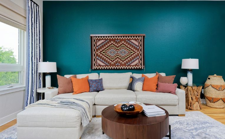
A: Our design approach to a space always becomes personal because we love to understand our client’s vision and how they see themselves in their space long after the design is done. In our mind, colors reflect personality, vision, and desires from a client standpoint. Colors are a function of what the client wants, and they may vary from combinations of orange and greens to neutral tones to bolder shades. This client is super nice, incredibly polite, and fun. She loves nature activities like hiking, canoeing, and being in open spaces. Our client has also traveled a lot to South America to countries like Peru and Chile. The colors chosen for this design reflect all this and include natural, earthy tones with pop of colors here and there. We love how it turned out, but more importantly, we love that the client is so happy with her place.

Q: The honey-hued hardwood floors in this design are beautiful and have a charming, old-world appeal. Were these original to the architecture of the place?
A: They are lovely indeed, and they were original to the architecture of the place, which facilitated the blend of colors and elements of our interior design.
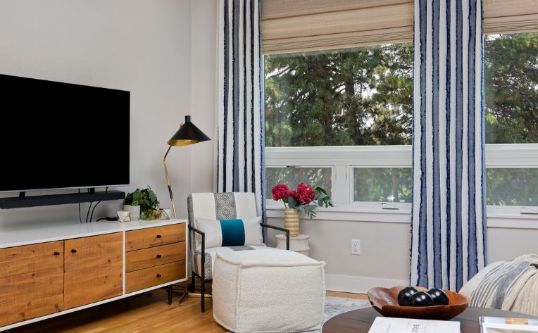
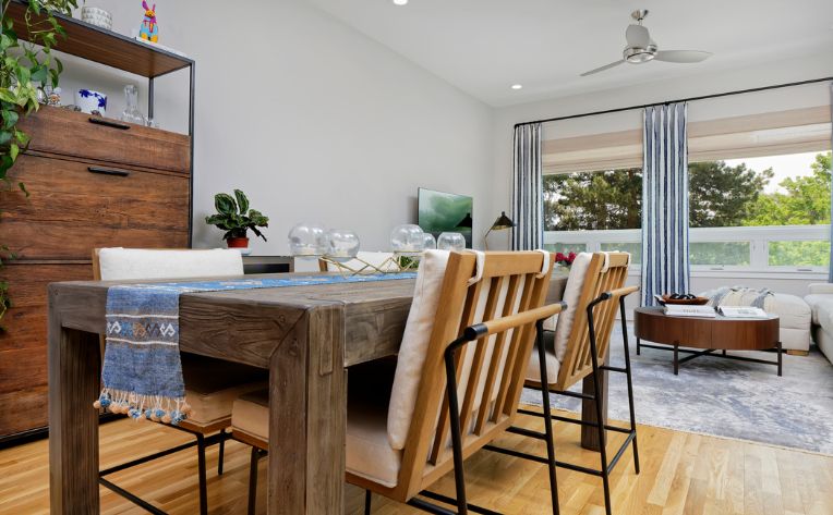
Q: There are many wooden objects tied into this space, from the light hardwood floors and airy dining chairs to the rich espresso dining table and dark wooden bookcase—but they all form a cohesively beautiful space. What are your top tips for successfully blending natural elements together?
A: These design processes are very personal. When there is a direct connection with the client and the client is not afraid of using patterns, combining colors, and mixing natural elements, then creative juices flow and the magic happens. A top tip for designs like these is to look for the flow of lines along the combination of different components to see how they mix and match with each other.

Q: There are some really unique pieces in this space, including the wall tapestry and the woven basket in the living room. How do you draw design inspiration from artwork and one-of-a-kind artifacts?
A: Our client is well traveled, especially to Peru, Chile, and other places in South America. As such, she had a rich portfolio of artwork that needed to be incorporated into the design. Our colors and overall material selection considered these pieces of art right from the start. We too love to travel. Traveling does many things for your soul, one of which is to give you a different perspective on life. It also makes for a good source of inspiration.
Q: We love the entryway table setup. What are some top design tips for making a good first impression with your foyer?
A: We believe mixing and matching different materials, elements, and colors can offer the opportunity to create an area or design that will stand out, particularly for spaces where you want to make the first impression last longer in a positive manner.
Q: We noticed that there’s a lot of different lighting throughout the space, from the overhead fan to the lamps to the tea light candles on the dining room table. How did you approach lighting when it came to this design?
A: Interior design incorporates so many different aspects that are equally important. Lighting cannot be isolated from colors, other materials, artwork, furniture, or wallpaper. We believe lighting can add to the harmony and cohesiveness of a design because it can—and should—highlight certain features of the interior design and the overall personality of the space when required. Our lighting design for this and any other design is based on this approach.