Oct 28, 2019 | Flooring Canada
If you love the look of patterns in interior design, then you’re in luck. Patterns are easy to mix and incorporate into every room of your house or apartment, bringing a dash of visual interest and excitement to any space. In this article, our design experts talk about some of our favorite ways to use and mix patterns at home. If you have questions you need answered about interior design patterns and textures, you’re in the right place!
Before you dive headfirst into your home makeover, take a few days (or at least a few hours) to find sources of design inspiration. My Design Finder is a great starting point, with thousands of visual examples to browse. Pinterest and Instagram are also great style sources. Check out relevant hashtags, like #interiordesign, #homedecor, #pattern, or #patterndesign. Once you’ve compiled some favorites, you’ll probably start to notice themes, which you can then incorporate into your home redesign project.
Many design experts recommend starting with about three different patterns to mix and match in your home. Here’s how to make sure they’re balanced:
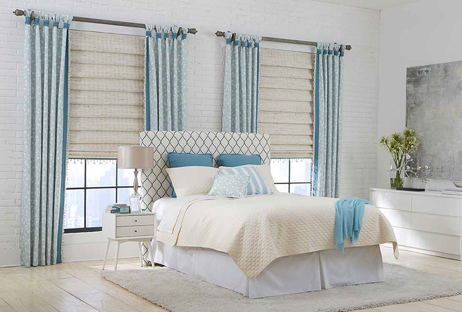
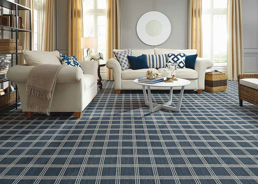
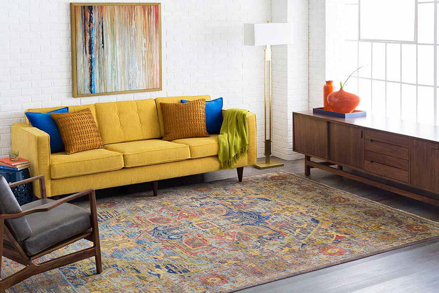
Examples of trendy and popular types of pattern in interior design include fleur-de-lis, gingham, damask, houndstooth, herringbone, polka dots, stripes, and tropical prints.
“Color intensity” is simply another way of saying “saturation” or how intense and vivid the color is. The less saturated a color is, the closer it appears to grey. The more saturated a color is, it will become brighter and more vivid.
High-intensity colors can overpower and drown out low-intensity colors. For that reason, it’s a good idea to choose patterns with similar saturation levels like three pastels, three dark colors, or three bright colors. Even if you’re mixing patterns, as long as there is a similar intensity of color among those patterns, you can mix stripes, polka dots, and florals to a striking and eclectic effect!
Once you’ve chosen some patterns you like, it’s time to start incorporating them into your space! There are countless opportunities to mix and match your favorite prints, including wallpaper, upholstery, carpeting, pillowcases, artwork, tapestries, and more.
The perfect pattern for your home is just waiting to be discovered. Get inspired with My Design Finder, which showcases thousands of gorgeous rooms and homes — all based on your custom style preferences. Whether you’re looking for something bold, subtle, kid-friendly, or sophisticated, you’ll find your style match on My Design Finder.
Looking for a great carpet to tie it all together? At Flooring America, we carry thousands of area rugs and wall-to-wall carpets, including waterproof and stain-resistant options. Looking for eco-friendly carpeting? We’ve got you covered there, too. From helping you choose the right carpet to installing it in your home or apartment, Flooring America is your one-stop-shop for quality home flooring. Contact us online to get started, or call today at (866) 695-6411.